|
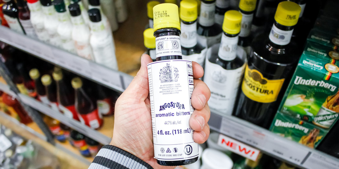
Angostura, a brand that’s practically synonymous with the cocktail bitters category, is a mainstay on the shelves of everyone from top bartenders to home mixologists around the globe. The bitters brand has been around since 1824 and is a regular feature in popular cocktails like the Old Fashioned, Manhattan, the Vieux Carré, and of course the Angostura Sour. But while the Angostura name is instantly recognizable, there’s a level of mystery surrounding the brand. First, the bitters recipe is an old family secret. In fact, only five living people know it — all of whom have agreed to preserve the secret. But it’s not just the contents inside an Angostura bottle that have long confounded drink lovers. The brand’s oversized label makes it stand out on the shelf and has long been a source of confusion for consumers. There’s a reason for that: It initially began as a mistake. When the brand’s founder, Dr. Johann Siegert, died in 1870, he passed the family business along to his sons Carlos, Luis, and Alfredo. The Siegert brothers decided to enter a competition to get their brand some press, and decided to do a rebrand. One brother designed the new bottle, while another brother designed the new label. The problem? Neither thought to consult the other about how to size them. By the time they realized that the label was too large for the bottle, it was too late to start over; they entered the competition anyway, oversized label and all. Though the Siegerts ended up losing the competition, one judge advised the brothers to keep the design exactly as it was. This, the judge said, would ensure that Angostura bitters would always stand out against the competition (who else would make the same silly mistake?). The Siegerts did just that. To this day, a century and a half later, the label on every Angostura bitters bottle is just a little too large, sticking up around the neck of the bottle. And while this has helped the brand maintain its uniqueness, it has also inspired some copycats. Brands like Forest Floor Foods, Fee Brothers, San Francisco Bitters Collection, and Underberg all produce bottles with oversized labels not unlike that of Angostura. This may simply be a classic case of imitation, or perhaps Angostura — a brand that’s been around a bit longer and is arguably more popular than the aforementioned brands — has influenced the bitters space so much that consumers now associate the entire category with having a large label. Either way, while Angostura started the trend, its large label is no longer one of a kind on today’s market. Unlike most of its imitators, however, Angostura uses its packaging mistake to its advantage; with all that extra label space, the brand provides useful information to its customers. In tiny blue lettering, Angostura’s labels detail the brand’s history, and contain Dr. Johann Siegert’s signature, a product description, product ingredients, and more — some of which is written in multiple languages. Angostura sure does know how to make a bitter situation into something sweet. Source: Katie Brown, Vinepair.com
0 Comments
Leave a Reply. |
T&T news blogThe intent of this blog is to bring some news from home and other fun items. If you enjoy what you read, please leave us a comment.. Archives
July 2025
Categories
All
|


 RSS Feed